ENVIRONMENT DESIGN
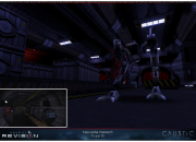
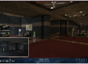
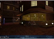
The environment design work in Revision was almost entirely done by Haris Buzis, the man behind the very birth of Revision.
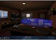
He took advantage of the raw processing power available in modern machines to push the old Unreal Engine to its limits. Much of his work is based around the idea of not just decorating a space, but giving it interesting architecture and lighting.
2D GRAPHICS
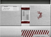
Revision bundles New Vision‘s high-definition textures for Deus Ex. At the beginning of the project, that was pretty much all we needed in terms of 2D graphics, but as Haris was building new, vaster and more detailed maps to navigate in, Revision needed to be enriched with our own textures and of all kinds of aesthetic enrichments in order for the environments to be filled with vibrance and visual complexity, to avoid larger spaces to feel empty.
Soon enough we felt that we really needed to have our own custom-tailored set of visual content, and that’s when our designer Cecilia Raffaeli came to the rescue.
Datavault
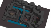
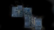
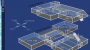
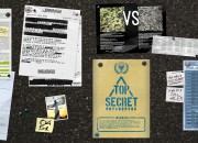
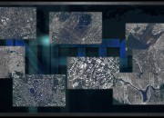
When Haris was in the process of overhauling Deus Ex’s maps’ geometry, game levels had become more complex and some of them had completely changed from head to toe. We needed to make sure that Davault pictures matched the new environments.
Because datavault images are such a core part of how directions are given to the player, Cecilia created a large variety of datavaults to bring the story and the levels together and to help players navigate smoothly through the new overhauled game experience.
Ads, Banners, and Signs, Oh my
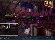
One of the common tropes of Cyberpunk fiction is the idea of vibrance above and grit below. In Revision, we created a huge number of ads, banners, posters and signs which decorate the buildings of New York, Paris and Hong Kong. These ads let us bring a great sense of color and vibrance to the cities, without making them feel crowded; the world can be lonely and dangerous at night, and we want to make sure that the sense of adventure is preserved.
Etc. Etc. Etc.
With time passing and development moving on, the project’s graphic needs grew larger and larger with the number of improvements introduced by Revision: game UI, project graphics, environment textures, and of course our website, are only some examples of Cecilia’s contribution to Revision.


